Understanding Quartiles for Research: A Guide to Better Data Interpretation
Collecting data is only the first step in any research. But understanding of data is important to draw remarkable results from the data or understand what data truly conveys to us. It tells how the values are spread out when you’re analyzing results, student grades, sales reports, or scientific data.
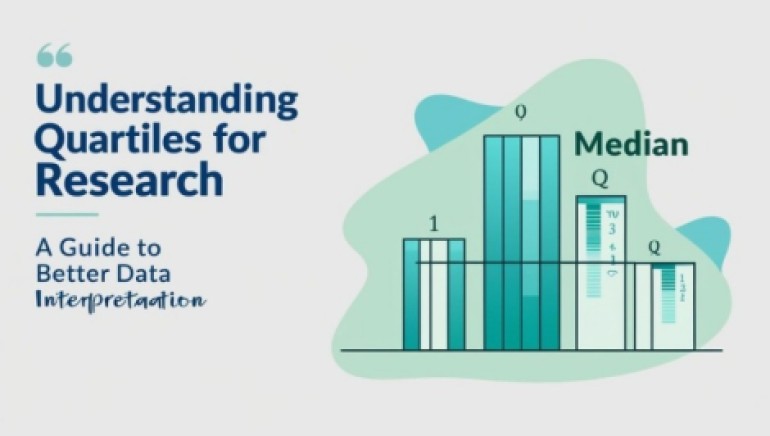
For a deeper understanding of data, one statistical concept that helps with this is known as quartiles. It divides your data into four equal parts. This division makes it easier to know the range, center, mean, and spread of information. They answer many questions regarding your data research:
- What are the lowest values?
- What does the middle value look like?
- What is the highest score?
Quartile interpretation helps in research for better decisions and more accurate findings. It helps to identify patterns, spot unusual values (outliers), and compare different groups. They are beneficial when you’re dealing with large datasets or trying to explain your results simply.
This blog is your complete guide to understanding quartiles. We’ll explain what they are, how to calculate them, and how they help to improve the ability to analyze and present data. Let’s get started!
What are Quartiles?
Quartiles are statistical values that divide a dataset into four equal parts. Each quartile contains 25% of the data points in an ordered dataset. They are particularly useful when analyzing the spread and skewness of data.
Quartiles are used in statistics to describe the spread and center of a dataset. Here are the three key quartiles. They are also known as types of quartiles. As we discussed above, quartile divides data into 4 equal parts. So, every part has its own formula to find the quartile, which is given below:
By understanding these divisions, researchers can quickly see the spread of their data, spot clusters, and identify any outliers.
How to Calculate Quartiles?
To find quartiles of data, researchers can use different methods. But here we’ll discuss the two most common methods. One of them is finding the Q1, Q2, and Q3 values using related formulas, and the other is the Box and whisker plot.
Method 1:
Let’s strengthen this concept of quartiles with a step-by-step example.
Example:
A researcher is analyzing the weekly study hours of 10 college students to understand their academic engagement. The hours reported by the students are: {20, 15, 17, 25, 35, 12, 22, 28, 30, 40}. Based on this data, find the following values:
- What percentage of students study 17 hours or less?
- What is the typical (median) number of hours students study per week?
- What percentage of students study more than 30 hours a week?
- What is the interquartile range, and what does it tell you about the variation in study habits?
Calculation:
- Firstly, sort your data in ascending order. 12, 15, 17, 20, 22, 25, 28, 30, 35, 40
- Now, find the first quartile
Q1:As we said above, it is the median of the lower half dataset. So, it can be the: [12, 15, 17, 20, 22]
Median of the lower half: 17 (you can also try the formula to find. It’s your own choice)
Answer 1: This means 25% of students study less than or equal to 17 hours per week.
3. Next, calculate the median (Q2):
If the dataset has an odd number of values, the median is the middle one. If it has even, take the average of the two middle values. Our data is even. Take the average of the 5th and 6th values.
Q2 = 22 + 25 / 2 = 23.5
Q2 = 23.5
Answer 2: So, half of the students study less than 23.5 hours. And the other half study more.
4. Find the Q3:
Q3 = Take the median of the upper half [last five numbers]
Q3 = 25+28+30+35+40 / 5
Q3 = 30
Answer 3: That means 75% of students study less than or equal to 30 hours per week, and only 25% exceed that.
5. At last, find the IQR to check the outliers in the data:
IQR = Q3 – Q1
IQR = 30 -17 = 13
Answer 4: This means the middle 50% of students study within a 13-hour range.
Method 2: Box and Whisker Plot
A box-and-whisker plot (box plot) is a graphical method used to display the distribution of a dataset based on five summary statistics: minimum, first quartile (Q1), median (Q2), third quartile (Q3), and maximum. It helps visualize skewness, central tendency, and potential outliers quickly.
Example:
Show the Quartiles of the following data using the Box and whisker plot method:
12, 15, 17, 20, 22, 25, 28, 30, 35, 40

Plot Elements:
- The blue box shows the interquartile range (middle 50% of the data: from 17 to 30).
- The red line inside the box is the median (23.5).
- The whiskers extend from a minimum (12) and maximum of 40.
- No outliers are marked, as all values are within the typical IQR bounds.
Tips for Better Data Interpretation with Quartiles
- Combine quartile analysis with mean, mode, and standard deviation for an impactful data interpretation.
- Use box plots or histograms for clearer interpretation of results.
- Find skewness in the provided data. If Q2 isn’t centered between Q1 and Q3, your data might be skewed.
- Apply IQR filtering on your data. This helps in cleaning data and focusing on the most relevant insights.
Application of Quartiles in Research
Quartiles are not just for academic life or just for some specific fields. It is used in different fields to interpret and analyze the data. Some of them are given below:
- In fields like psychology, sociology, and education, researchers use quartiles to analyze test scores, survey responses, and experimental data.
- Quartiles help in dividing customer data, analyzing consumer behavior, and tracking sales performance. Businesses often analyze the top 25% of customers (Q4) to tailor high-value marketing strategies.
- Medical researchers use quartiles to study vital signs, lab results, and treatment outcomes. Understanding quartile positions helps identify patients at risk based on measurements like blood pressure or cholesterol levels.
- In finance, analysts apply quartiles to measure investment returns, detect risks, and compare performance across different portfolios or assets.
- Scientists studying climate or pollution use quartiles to analyze temperature trends, pollution levels, or resource distribution across different geographic regions.
Final Thoughts
Understanding quartiles is beneficial for any researcher who works with data. Quartiles divide your dataset into four equal parts, which helps you see the spread, center, and variation in the data. They give clear answers about how values are distributed. It identifies outliers and compares different groups.
Quartiles can guide decision-making in analyzing student performance, sales data, medical reports, or scientific results. By using different methods like formulas or box plots, you can quickly find Q1, Q2, and Q3. It helps to make your data analysis clearer and more reliable.

_1724408427.jpg)

_1724335987.jpg)